News & Updates: Data in Practice: Communicating Data – Part 2
Data in Practice: Communicating Data – Part 2
Posted by Marie Jonas
Last month, I reflected on Hemmingway’s golden rules for writing, and how to apply them to communicating data. First, we covered concision – using PivotTables and data aggregation. Today, we will look at vigor – through thoughtful formatting and simple graphics. Next month, we will focus on positivity – how to put your best foot forward while applying the principles of concision and vigor.

In talking about vigorous data communication, I would be remiss not to direct readers to the work of Edward Tufte. Years ago, a colleague introduced me to his series on visual communication. His books and presentations are truly an invaluable resource for understanding the power of communication beyond words.
What is vigorous communication? Professional writers describe it as passionate, focused, and intentional. For data, that can mean drawing the subject’s eye to the right place and applying proper emphasis. For lawyers, counsel should put as much thought into which data to include and how to show it as she does into the words she uses in summation or analysis. While there are endless ways to apply this principle, today I focus on two: formatting tables and creating simple charts.
Be Vigorous – Emphasize with Formatting
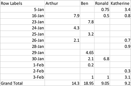
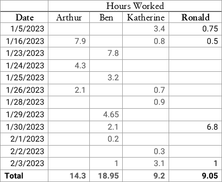
Passion, focus, and intention can be captured with proper formatting. Compare the following tables of time entries, imagining Ronald’s total hours is what we care about:
Perhaps not perfect (beware of formatting rabbit holes), but Example 2 more clearly grabs the subject’s attention and places it on the information that we care about – Ronald’s total hours.
Using formatting and organizational choices wisely can serve to accentuate key information, focus the subject’s attention, and prevent distractions. Counsel can grab a client’s, or judge’s, attention through simple visual emphasis (bold or a darker color).
Let’s go through a few steps to get from Example 1 to Example 2.
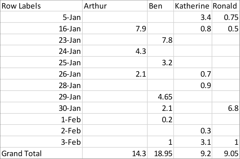
You start with the raw data in Excel. First, you can fix the date format by selecting the cells, navigating to the cell format dropdown, and selecting “Short Date” (or hit CTRL+1 to open the full Format Cells menu).
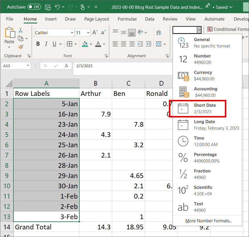
Cut and paste to move Ronald’s information to the right, where it will stand out compared to his neighbors, then copy and paste the full table into Word.
A word on Word. Once you have the data you want, Word is a simpler platform for tweaking font and formatting.
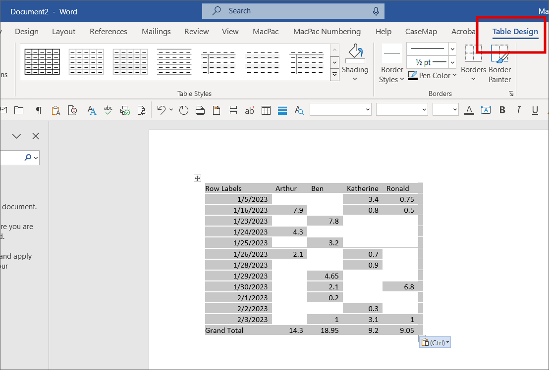
Click on your table in Word, and go to the “Table Design” menu that appears on your Ribbon.
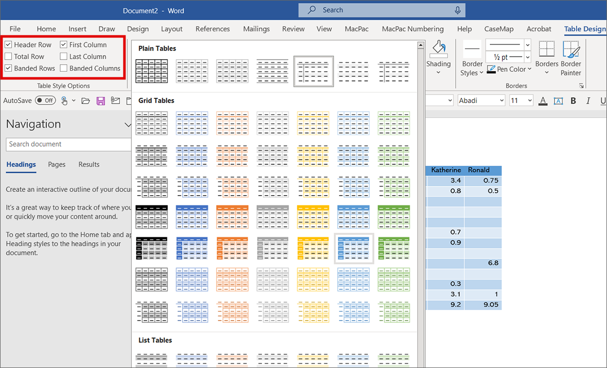
You can select from different colors and emphasis, and adjust table settings like “Header Row,” “First Column,” and banded rows and columns.
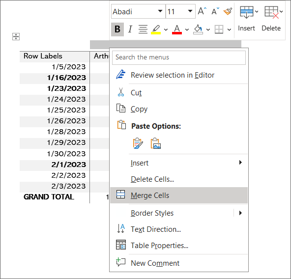
Sometimes inserting a table title is helpful. Right click on the top row, then “Insert” and “Insert Rows Above.” After that, simply select the cells to merge and type your title.
Remember to update the font used in your table. The system font in Excel, Calibri, is easy on the eyes when working with numbers, but can be dull when communicating results. In data and word processing, whatever font you choose, make it a choice – not a default. I like Sabon and Heebo for this table.
When you are done formatting, you can copy and paste your table anywhere it is needed. Remember, use formatting wisely. In general, simpler is better. The goal is to emphasize your data narrative, not distract from the key point.
Be Vigorous – Visualize
Numbers and words are often not the right tool to tell a data story. Rather, a chart could be more impactful and concise.
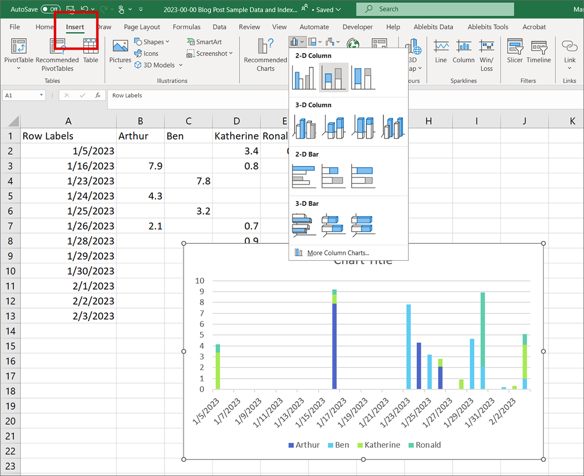
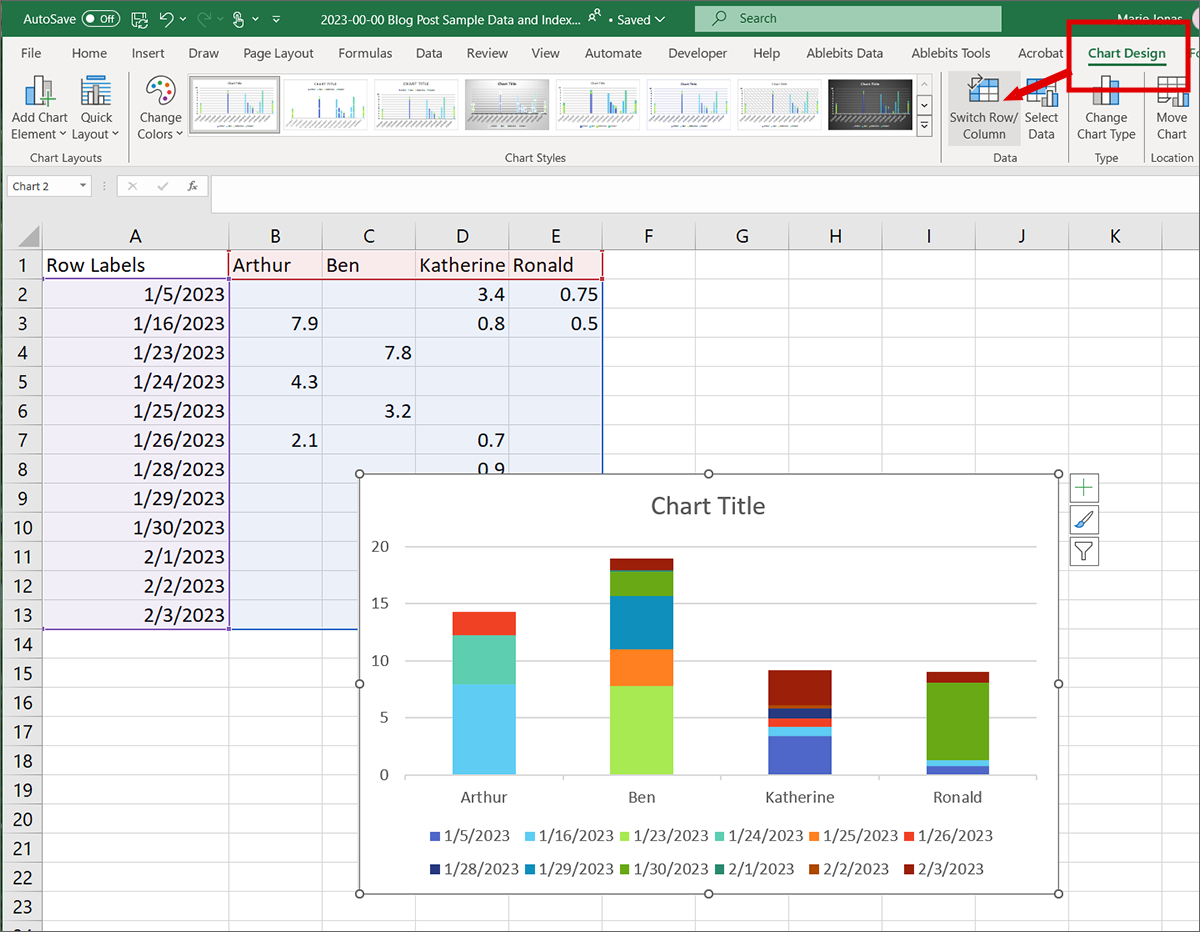
I am not an expert chart builder, but for simple charts in Excel, you don’t have to be. Select your data, head to “Insert” on your ribbon, and select a chart option that you are looking for.
For this data set, the goal is to see each person’s time compared. You can see above, Excel defaulted with the stacked column chart to displaying the date on the X-axis. To fix, navigate to “Chart Design” and select “Switch Row/Column
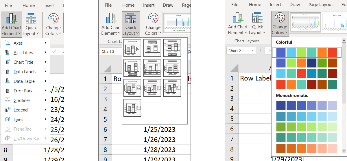
From there, it is easy and quick to experiment with different options for headings, colors, elements, and layouts using the options in Chart Design.
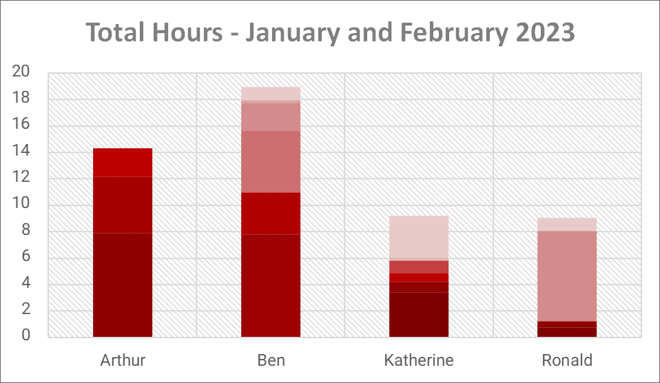
With just a few clicks, my raw data can be transformed into a visually pleasing and simple Stacked Column chart.
For lawyers, clear data communication can be as important as persuasive writing. Vigorous visuals cut through complexity, boost persuasion, and ensure everyone understands the facts, making them a powerful tool in an email or a courtroom.
Data permeates every aspect of legal practice. Data in Practice is a monthly feature to provide practical tools for attorneys to better organize, manipulate, and understand data. Whether it’s working with basic case information, preparing document productions, or conducting exposure analyses, a more robust knowledge of Excel is guaranteed to streamline your work. A few simple tools can help attorneys more efficiently and effectively represent their clients, and better navigate a professional landscape inundated with big data.
Marie Jonas is a Partner in Folger Levin’s litigation practice group. Marie has over a decade of hands-on experience working with Excel in all aspects of her practice: ranging from investigations to trial. If you have an idea for a topic involving practical data tips for lawyers, she can be reached at mjonas@folgerlevin.com.
